Elastic’s Clarissa Donlevy Marries Print with Digital For Showtime’s “Gossip” Docuseries on Cindy Adams

It is rare for a legend to phase out of their career without needing to worry about replacement by someone younger, smarter, funnier, more beautiful or more connected. Cindy Adams need not worry simply because the power of her trade has been made extinct by the rise of social media. The evolution might be more sad if it weren’t so interesting, or if Cindy herself didn’t have such a quick-witted sense of humor about it.
The 91-year-old couture-wearing firecracker is profiled in a new docuseries directed by Jenny Carchman and produced by Imagine Documentaries, premiering on Showtime on August 22nd. Owning the lead byline on the New York Post’s infamous Page Six gossip column for the last 40 plus years made Cindy one of the city’s most powerful voices. Whether readers admitted to it or not, Cindy’s daily column influenced, if not entirely made the names and stories that circulated and drove the cultural conversations. Prior to the advent of an internet-connected phone in everyone’s pockets, Cindy’s editorial power was more like society's puppet master, pulling the strings on who or what gained power. One of her main subjects even became President.
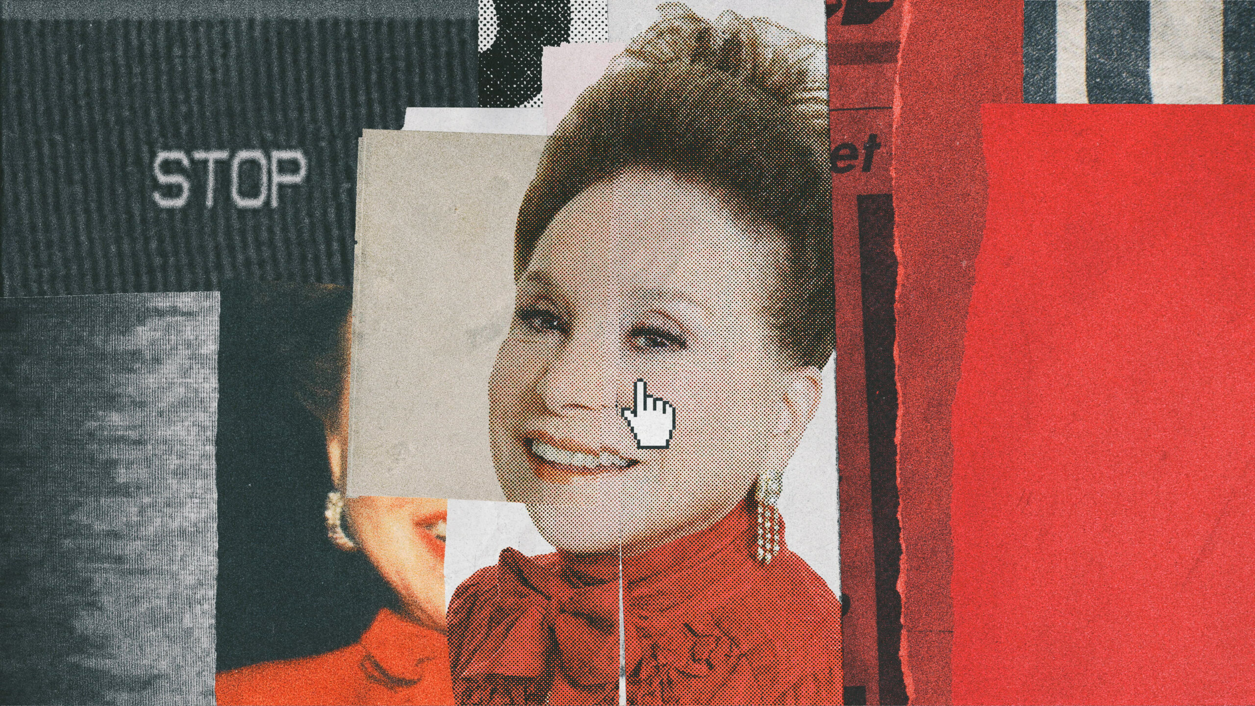
“The power of gossip is really quite fascinating,” said Elastic Creative Director Clarissa Donlevy. “There were a whole lot of maybes and mights in Cindy’s articles, with very sensationalist headlines, but people like to believe what the Post says, whether or not there’s truth to it.” As the Post is notorious for its sensational headlines, Clarissa knew she wanted to carry that bold and cheeky allure into the docuseries’ main title and graphics package. Very early in the design process, Clarissa also imagined that the behavior of collage - with its layering and rough-edged partiality - would lend itself perfectly to the tone she wanted to create. “The look came together very quickly. Jenny liked it and pulled some references for the animation, so it was kind of a one-and-done situation, which is pretty rare.”
The title sequence is a textured and animated collage of headlines and clippings ripped from the paper’s archives, meant to either jog viewers’ memories or educate them on nearly half a century of news. Using the paper’s striking red, white, and black color palette, the narrative moves through a chronological journey, starting with Rupert Murdoch’s purchasing of the paper in 1976, up until present-day Kimye drama. “We had so many newspaper articles, quotes, and images to feature that were older and not of great quality,” Clarissa added, “but when we originally designed the main title we were free of those restrictions. This meant we could bring high production value to the table and reverse engineer the image search, which allowed us a lot of creative freedom.” The tactical feeling of the paper was also key to Clarissa’s early design. “In this digital age, a lot of people don’t even know what it feels like to hold a newspaper so we wanted to capture the feeling of what it's like to roll the paper or turn a page. We dialed that in further with jagged edges, tears and folding.”
To get both the content and the texture they wanted, Clarissa and her team shot blank newspapers and then matched existing articles from the Post on top of them. “We recreated many images, including Cindy’s, and made it look very graphic. There's a lot of craftsmanship involved in creating this specific style and texture.”
Clarissa’s stylistic intent to re-touch history also raises questions about how much of the past actually stays in the past. On the other hand, the digital age has completely exacerbated the news cycle. “The birth of social media coincided with the end of Cindy’s career,” Clarissa noted. Though a daily newspaper column will never have the gas that it once did, it unequivocally gave way to the stories we are talking about today.
Check out the main title for Gossip below, premiering on Showtime on August 22nd.
