Creative Director Hazel Baird Turns Their Love of Horror Into Eight Terrifying Titles for American Horror Stories: Season Two

Returning to the show for their second season, Elastic's Hazel Baird shares their process behind the eerie title sequences, how they assembled each unique team of animators, and their love of all things horror.
Elastic Creative Director Hazel Baird is a huge horror fan, so when the opportunity arose to work on the main titles for American Horror Stories last year, they jumped at the chance. “Kate [Berry] knew I was really into horror, so she thought I would be a good fit for the project,” they said. That enthusiasm rings true again in the second season of FX’s cult classic weekly anthology horror series. This year, Hazel has played a slightly different role by now also hand-selecting various animators to create each of the eight individual sequences. Read on to learn how Hazel coordinated the production of these unsettling yet gorgeous titles.
Q: Tell us about the collaboration process for this project.
A: I was more heavily involved in every single main title than I was last season. I'm really good at finding the right people for the job — that’s my superpower. People have different styles and different ideas, so it was just a matter of picking the right people for each episode and guiding them on their work. I’d fill them in on the concept and what the client wants, walk them through the script, offer advice, and then let them go from there. I think a lot of people who hadn't worked with us before were surprised about how collaborative the process was — it always takes a bunch of people to make a sequence. It's not just one person, you know?
We worked with some animators we had standing relationships with, like Erica Gorochow, who I worked with on The Andy Warhol Diaries, and Bruno Ferrari, who we work a lot with on Elastic projects. We also worked with some new faces, some people I’ve connected with through various networks like Facelift (who were old art school friends of mine), and some that I spotted on Instagram. I hadn’t worked with Worship before either, who worked on “Milk Maids” and “Aura,” but I had heard of their great work, so I wanted to bring them on.
Q: Are there any titles that stand out to you?
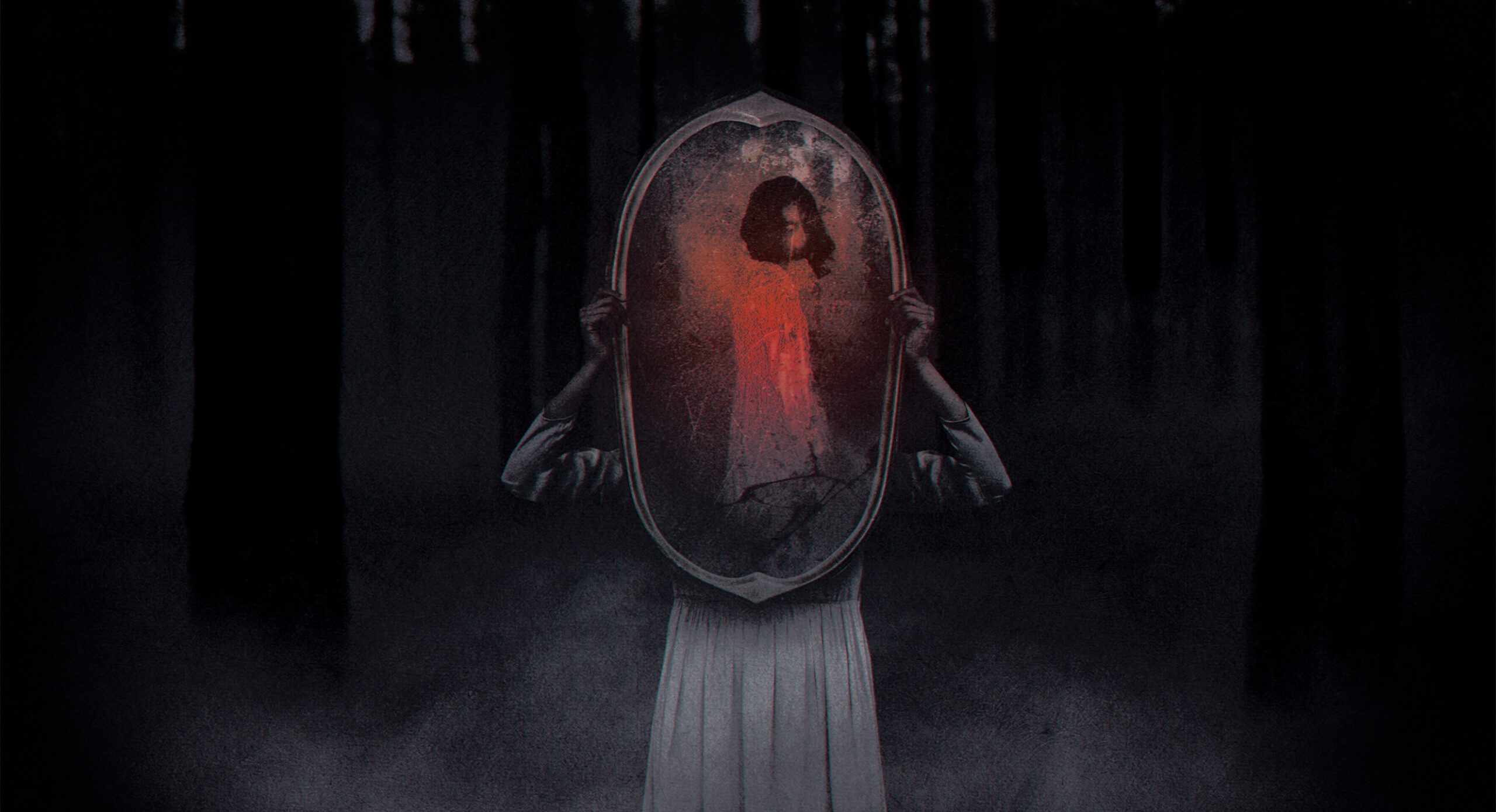
A: It’s so hard to pick one that stands out over the others — it’s kind of like picking between favorite children! I really like “Bloody Mary” because it’s so stylized. Two of the animators, Taylor Yonze and Steve Savalle, come from a 2D animation background, so they brought that feeling to the title. “Lake” has a murky, eerie green theme since it’s underwater. I find it disturbing when you can’t see what’s right in front of you — I think that taps into a very common human fear, and they use that well in the sequence. “Dollhouse” is another favorite because I filmed all the doll scenes on my iPhone, before heavily grading them. That's one thing I really like doing, grading. I like taking footage and turning it into something so different that the viewer isn’t sure exactly how we did it. What we shot was all very simple, but it was really effective when integrated into the sequence. “Milk Maids” was definitely another favorite too.
Q: What’s the secret to making a successfully scary title?
A: When it comes to a project like this, it’s a good thing to really love horror — that way you understand what really scares people. If someone loves horror movies, they probably have the familiarity with what works about the genre that’s needed to create a sequence with a really strong effect.
Watch the Season 2 montage reel below to see each title in action.
