A VFX Breakdown of IKEA’s “Our Little World”

VFX Supervisor Jesse Monsour and CG Supervisor Andy Wilkoff dissect how they created the imaginative spot.
Our Little World is a fantastical spot that puts sustainability in the spotlight by depicting simple changes we can all make to reduce consumption and protect the world we live in. The project marked a creative reunion between Director Mark Zibert and a52’s Jesse Monsour (VFX Supervisor) and Andy Wilkoff (CG Supervisor), who also collaborated with the creative agency Rethink to bring it to life.
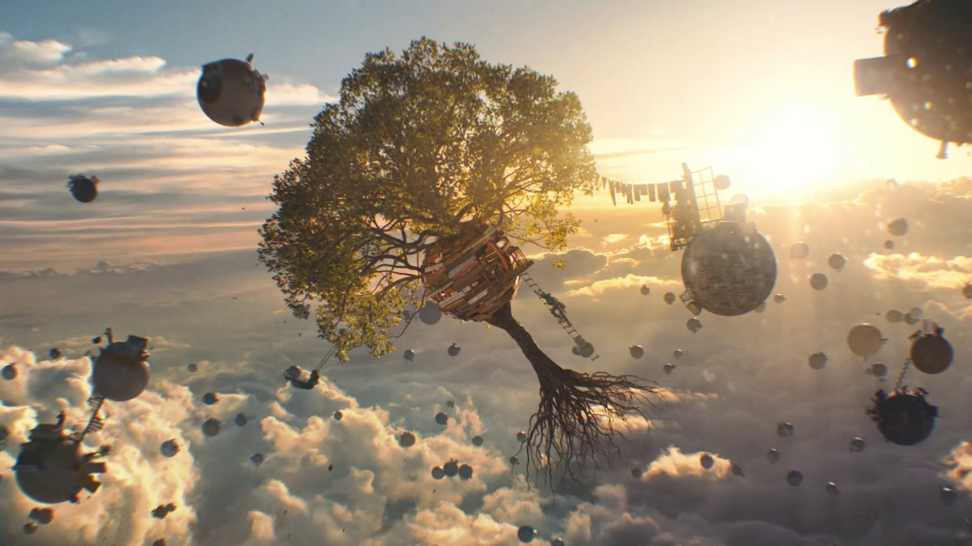
Achieving the out of this world creative - a realm that casts furniture, built to scale, sitting and moving on tiny, floating, spherical planets - involved complex and challenging VFX work, as detailed below by the artists who created it. Check out the behind the scenes video, as well as a deep dive on the making of the spot.
Q: How did you approach creating this spot?
JM - The general approach started with sketching out what we wanted to capture in camera in the form of concept art and previz. This helped us design the shots with Mark, so we knew which parts of the planets we would actually shoot and which parts would be created in CG. It also helped us know which plates to capture during the shoot.
AW - Not only were there multiple planets that needed to be created for this spot, but every world needed to be distinctive while still feeling cohesive with one another in this shared universe. In the foreground of the spot, we had our hero planets that were primarily composed of live-action, then we had the mid-hero planets that showcased IKEA furniture, and then there were the planets in the deep background that needed to look as though they too housed IKEA products. In total, we probably built 45 to 60 unique little planets for the spot. Each world also had its controlled elements, in terms of color and what type of wood, carpet, or grass was used. At the end, it became a virtual collage of all these little ecosystems.
Q: What was your favorite shot and why?
JM - For me it’s the shot where we follow the honey bees from the woman’s balcony, past their spherical hive, and further on to the bike messenger and the entire universe of tiny planets beyond. It's a great reveal of the spot’s world and captures the massive scale perfectly. The CG was executed beautifully. The shot itself is long and takes its time to unfold. It's a great discovery of the universe. Credit to Mark Zibert for dreaming it up and Richard Hirst for comping that thing. Not an easy feat.
AW - I’m also partial to the shot of the bees as well, but it wasn’t without its own unique set of challenges. The major hurdle for this particular shot was taking what was shot in-camera, adding CG bees, and then moving everything into a completely virtual world that didn't exist yet. That was a big undertaking in its own right, but we then also needed to make sure that it felt believable and real, even in this fantastical universe. It was a true technical challenge to combine all these intricate levels without this shot looking rushed, inaccurate, or having weird little jerks and jitters.
JM - We tried to use as much of what was shot as possible including a practical beehive created for production. Mark wanted the camera to be as smooth and fluid as possible so we actually had to replace the beehive in CG. Thankfully production gave us a perfect reference to work from. There were about 10 different plates in that shot: the woman, the beehive, the guy on the bike, guys playing chess, the chalk drawing, etc.
Q: What was the biggest challenge you faced?
AW - The real Herculean effort was building the number of assets and variations that we did, while keeping them within a flexible system. The artists did a great job. Also, Jesse’s close relationship with Mark created a shorthand; he put trust in us which was really important with so many moving pieces.
JW - It sounds obvious but the most difficult part for me was finding images for the back plates that suited the look. We wanted to keep it as real as possible and not fall into the realm of over-fantasy. The clouds in the background and the lighting direction all had to be perfect to match up with the plates and determine the look and spirit of the spot.
